The Power of Visualization in Decision Making
While complex decision-making is a cornerstone of product leadership, the process of reaching effective group decisions remains frustratingly chaotic in many organizations. If you're a leader struggling with messy, unproductive decision meetings or a team member tired of seeing the loudest voice win every debate, this article introduces a visualization technique that will transform how your teams make decisions and dramatically improve your outcomes.
Why Decision Making Is So Demanding
Depending on your company culture, decision making can be remarkably challenging. This explains why many managers are nostalgic for the „good old days“ of top-down management and command-and-control leadership. But today's digital product landscape is far more complex and requires collaborative decision-making. Building successful digital products is a multifaceted challenge that no one person can fully understand or manage alone.
Effective decisions require domain expertise across multiple disciplines. Digital products demand, at minimum, specialists in Technology, User Experience, and Business. Without additional depth in Sales, Marketing, User Research, Legal, and Analytics, scaling successfully becomes improbable. Decision making must therefore integrate numerous dimensions—from technical feasibility and usability to business viability, ethical considerations, legal compliance, and long-term value creation. We must weigh production costs, maintenance requirements, distribution channels, user acquisition strategies, scalability potential, user satisfaction metrics, and countless other factors.
In theory, decision-making meetings with key stakeholders should operate as well-oiled machines. Discussions would flow logically, participants would comprehend each perspective, and arguments would receive appropriate consideration, culminating in sound, informed decisions.
But wait—not your experience? Certainly not mine either.
The Reality of Group Decision Making
Having observed countless decision-making sessions throughout my career—both as a leadership coach watching from the sideline and as a product lead directly participating—I've witnessed predominantly chaotic proceedings. Participants typically hurl arguments across the table, rapidly shifting between perspectives without genuinely processing others' viewpoints or their implications. Eventually, someone—perhaps the HIPPO*, the loudest individual, or the team favorite—dominates the conversation and steers the group toward a conclusion. Not necessarily the best decision, but at least a decision—which often provides welcome relief for all involved. Finally, forward movement!
Over time, I've recognized how these discussions confuse various decision-making phases. We intermingle the dimensions under consideration with their relative importance and the evaluation of options against these criteria. We attempt to compare fundamentally different elements, sometimes forcing them into prioritization frameworks—as though user satisfaction and maintenance costs share a common measurement scale. Amid this confusion, clarity and direction evaporate.
A Structured Visualization Approach
Several years ago, I encountered an elegant method for visualizing decision options that I've employed consistently since. Its effectiveness stems from a fundamental principle: shared visualization cultivates shared understanding. The visualization process demands structured thinking, which naturally guides groups toward more disciplined discussions and ultimately superior decisions. Here's the streamlined approach:
Map your options – List all alternatives and assign each a distinct symbol (triangle, square, circle, diamond) and optional color code.
Identify key dimensions – Collectively determine which factors must inform your decision.
Create your visualization framework – List these dimensions in the first column of your canvas, whether using a flip chart, whiteboard, or digital platform.
Establish evaluation scales – For each dimension, draw a horizontal line representing a scale (e.g., "low" to "high" for maintenance costs). Position the beneficial end consistently on the right (lower costs, higher scalability).
Evaluate systematically – Assess each option against each dimension in sequence. For instance, evaluate all options on cost before moving to scalability.
Plot your findings – Mark each option's position on every scale using its designated symbol. Precise measurements aren't essential—comparative positioning suffices. You needn't know exact production costs, only whether Option A costs more or less than Option B.
Connect the dots – Link each option's symbols across all dimensions, creating distinct profile lines (color-coding helps differentiation).
Analyze visual patterns – Examine and discuss the resulting option profiles.
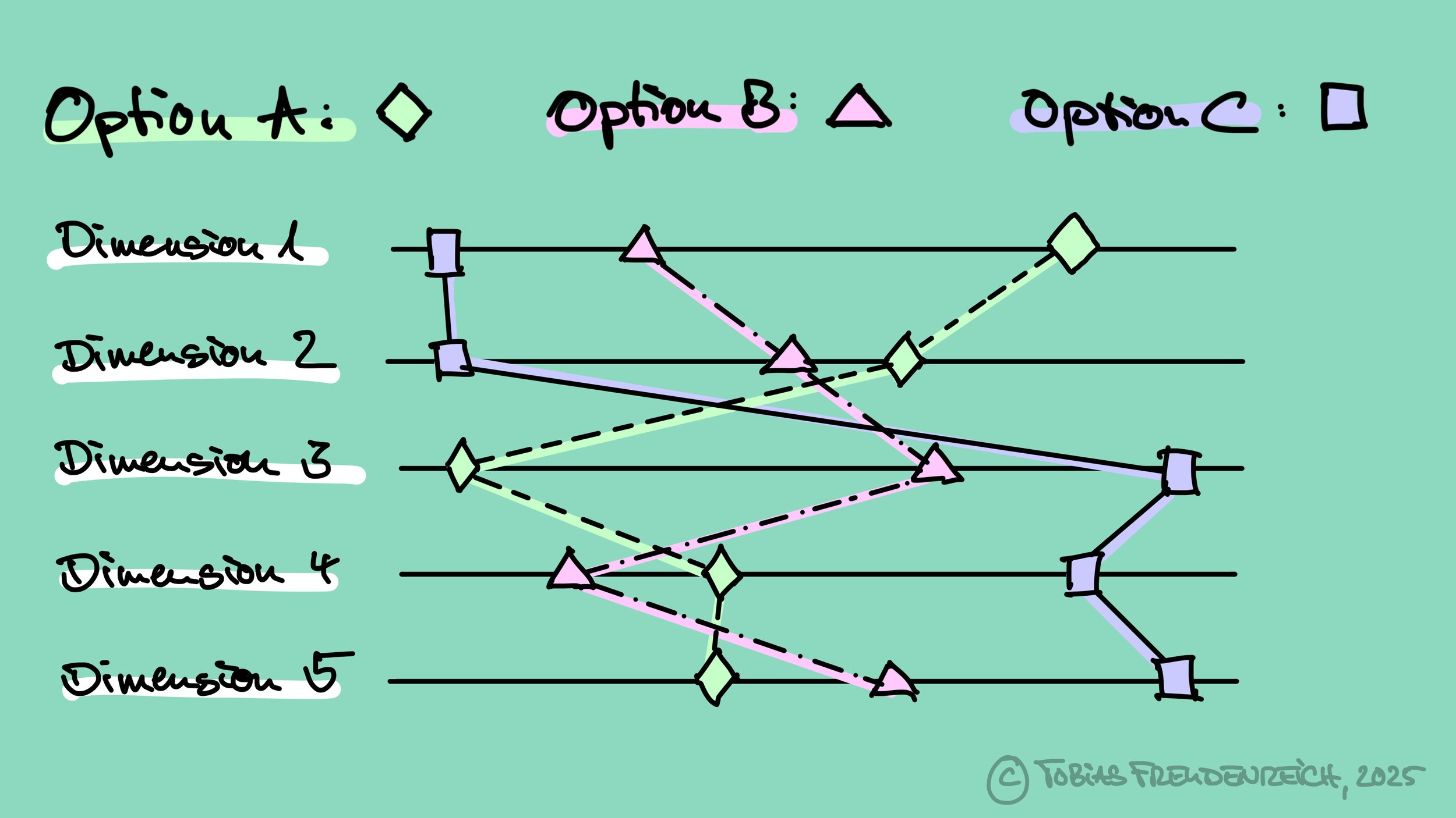
Image: Visualization of three options on five dimensions
Why This Works
This technique offers a powerful yet accessible method for structuring group decision-making. By separating the process into discrete steps arranged in logical sequence, you first establish the relevant dimensions before methodically evaluating options against each criterion. This focused approach encourages attentive listening to domain experts and thoughtful integration of specialized insights into the broader context.
The final visualization provides a compelling representation of each option's profile, enabling clear comparison of strengths and weaknesses. This often sparks a productive discussion about the relative importance of different dimensions, potentially leading to refinements in your visualization. For instance, you might rearrange dimensions vertically according to priority, listing the most crucial factors at the top.
One might argue that a clear understanding of the desired outcome or goal should be sufficient to determine which option is best. But in my experience, even the best goal leaves room for interpretation and at least slightly different perspectives. In these situations, the method described can help to surface those misalignments and sharpen the goal definition. In the end, you may not only have chosen an option, but you may have effectively clarified your common goal.
A Real-World Example
Several years ago, I coached a leadership team through a comprehensive transformation of their organization. Their goal was to establish a modern product organization operating on the Product Operating Model. During one of our initial workshops, we evaluated various options for structuring this new organization. The central question: which paradigm should guide the division of units and teams? Among several possibilities, two options emerged as the focus of intense discussion:
Option A: Division by Target Groups (one unit for B2C customers, one for B2B customers, one for partners)
Option B: Division by User Experiences (integrating interactions across B2C, B2B, and partner touchpoints)
As the discussion progressed, the dialogue became increasingly convoluted. Team members began conflating multiple aspects—debating simultaneously about which decision criteria mattered most, how each option should be evaluated against these criteria, and even their fundamental understanding of what each option entailed.
Recognizing this pattern, I intervened and suggested we visualize our discussion. We began by clarifying our understanding of each option, quickly revealing several misconceptions about their definitions. After establishing a shared understanding, I created a visual representation on a flip chart, assigning distinct symbols to each option.
Only then did we turn to identifying decision criteria—the dimensions against which we would evaluate our options. The leadership team determined that five key dimensions should guide this particular decision (simplified here for clarity):
Domain Complexity: How manageable would each team's domain be under each structure? Would teams face high complexity (undesirable) or more focused domains (preferable)?
Outcome Focus: To what degree would each structure enable teams to pursue clear, singular objectives and measurable outcomes?
Scalability: Which organizational structure would accommodate growth more effectively as the company expanded?
Development Speed: Which configuration would enable greater team velocity and reduced time-to-market?
Transition Complexity: How challenging would the transformation be from the current organizational state to each proposed future state?
With these dimensions established, we conducted a collaborative assessment of each option across all five criteria and plotted the results on our visualization. The resulting profile diagram revealed distinctive patterns that immediately clarified the trade-offs between our options:
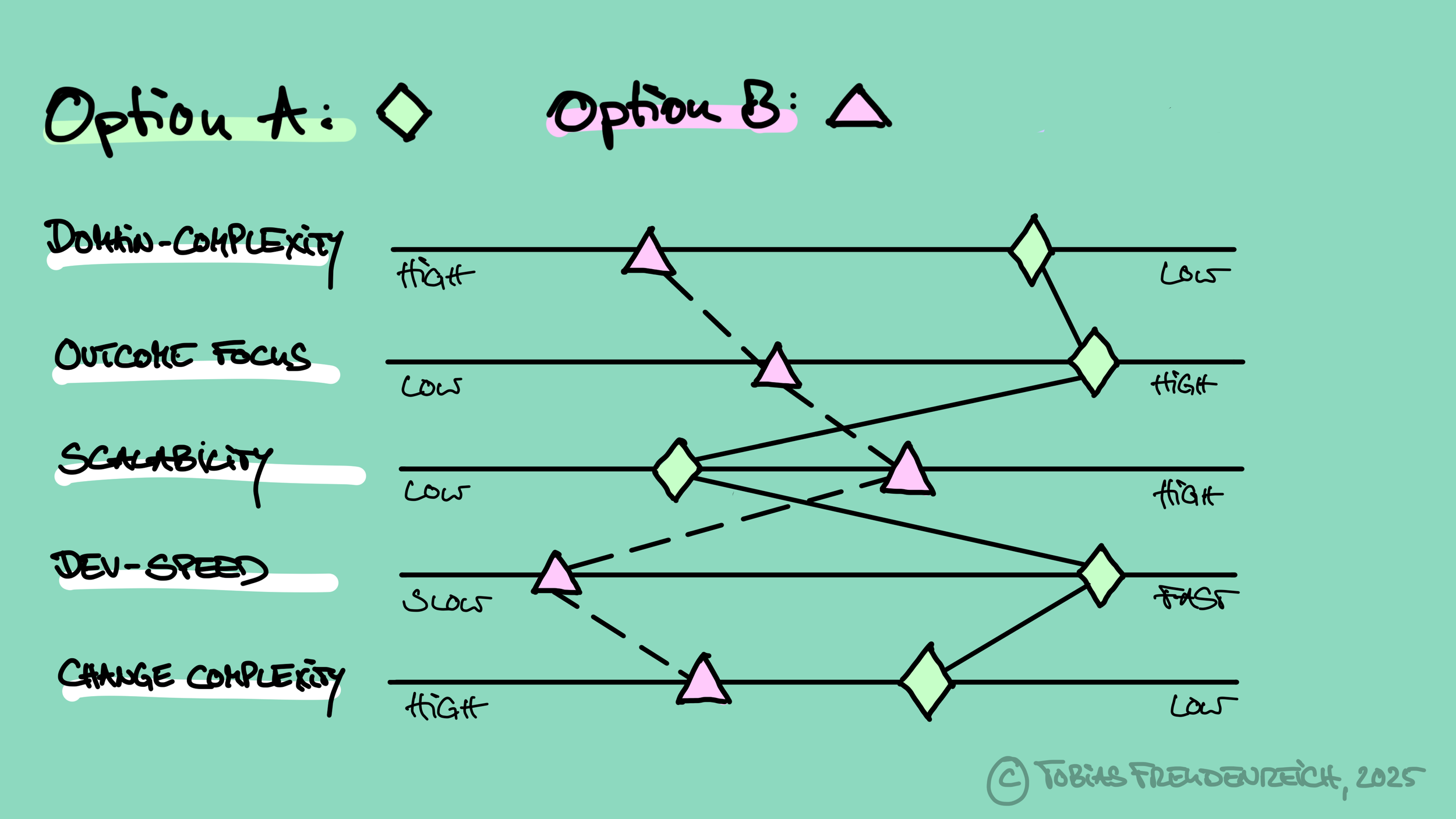
Real-world example of a visualization for decision-making
This visual representation transformed our conversation. Rather than continuing to debate abstractions, the team could now focus on the concrete implications revealed by the diagram. The visualization made evident that Option A (diamond) offered advantages in outcome focus, development speed, scalability, and lower change complexity—making it easier to implement in the short term. Option B (triangle) showed its advantage in scalability—which several members of the leadership team identified as the most critical dimension for their long-term success.
The crossing lines in the diagram perfectly illustrated the fundamental trade-offs facing the leadership team. What began as a tactical discussion about organizational structure evolved into a strategic conversation about transformation goals. Through this visualization exercise, the team was able to sharpen their understanding of what they were truly trying to achieve with the transformation.
The visualization didn't make the decision for us, but it significantly elevated the quality of our decision-making process. It transformed a chaotic, multi-dimensional debate into a structured evaluation of clear trade-offs, allowing the leadership team to have an informed discussion about their strategic priorities and the true purpose of their transformation journey.
Transforming Decision Culture
The beauty of this visualization technique lies in its simplicity and adaptability. It requires no special tools or expertise—just a willingness to structure your thinking and discussions differently. Yet its impact can be transformative, elevating decision quality while reducing the fatigue and frustration that typically accompany complex choices. By making the invisible visible, you create a shared language for decision-making that transcends functional silos and personal agendas, allowing the best ideas—not the loudest voices—to prevail.
Give it a try in your next decision meeting, and watch how quickly your team adopts this approach as the new standard. Let me know how it worked out for you!
*HIPPO = Highest Paid Person's Opinion